
Visuals in worksheets are defined as any graphic element, image, diagram, or illustration used to support, clarify, or reinforce instructional content. Research confirms that the role of visuals in worksheets extends beyond decoration. They shape how students process information, build mental models, and stay engaged with tasks. A 2026 MDPI study found systematic visual use improves comprehension, participation, and motivation, especially for students with limited language proficiency. Tools like Canva have made it easier than ever for educators and parents to apply these findings directly in worksheet design.
What does research say about the cognitive impact of visuals in worksheets?
Visuals affect how the brain processes and stores information. The key concept here is cognitive load, which refers to the mental effort required to process new material. When visuals are well-designed and relevant, they reduce that effort. When they are poorly placed or irrelevant, they increase it.
A 2026 Frontiers study with 81 nine-year-olds found that visual aids during arithmetic tasks produced more errors and longer answer times compared to text-only conditions. This means adding images to a worksheet does not automatically help. The wrong visual at the wrong moment can actively interfere with learning.
On the other side of the evidence, visual strategies in primary schools show measurable gains in comprehension and student confidence when applied with purpose. The difference between these two outcomes comes down to relevance and placement. Key findings from current research include:
- Visuals that directly represent the task or concept support mental model-building.
- Decorative images with no instructional function increase cognitive load with no benefit.
- Placing visuals far from related text forces students to scan back and forth, splitting their attention.
- Students with lower prior knowledge are more vulnerable to visual overload than advanced learners.
A 2026 Springer study found no interference with up to three visual elements per task, provided those elements were explanatory rather than decorative. Quality matters more than quantity. One well-chosen diagram outperforms five generic clip art images every time.
How do different types of visuals influence worksheet effectiveness?
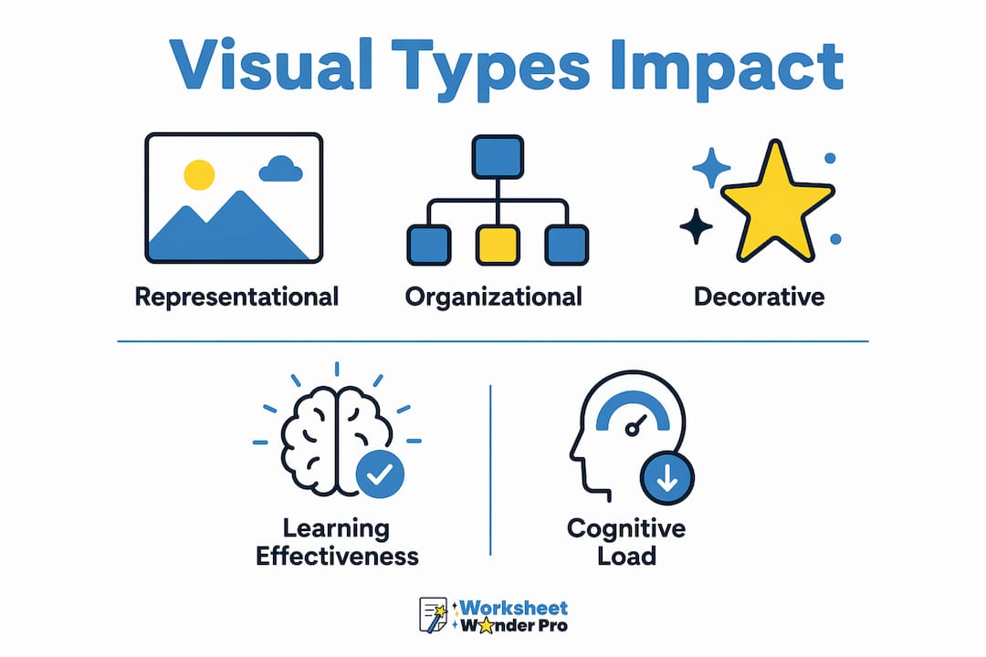
Not all visuals function the same way. Research identifies three main categories that produce different outcomes in student learning.

| Visual type | Function | Effect on learning |
|---|---|---|
| Representational | Depicts the task situation or concept directly | Supports comprehension and model-building |
| Informative | Provides data or facts not in the text | Helpful when integrated well; harmful if isolated |
| Decorative | Adds visual appeal with no instructional purpose | No learning benefit; increases cognitive load |
Representational visuals are the most consistently effective. A diagram showing how water cycles through evaporation and condensation gives students a concrete anchor for abstract vocabulary. Informative visuals, like a labeled graph in a science worksheet, work well when placed directly next to the text they support. Decorative visuals, such as a cartoon sun added to brighten a math page, carry real risk. A systematic review on pictures in math word problems found that decorative images can hurt performance by creating split attention and adding decoding demands with no payoff.
Student characteristics also shape how visuals land. The same review found that visual aids benefit students with higher prior knowledge while potentially hindering those with lower skills. A student who already understands fractions can use a pie chart as a quick reference. A student still building that concept may find the chart confusing without additional explanation. Knowing your learners determines which visuals belong on the page.
What are best practices for using visuals effectively in worksheets?
Mayer's multimedia learning principles provide the clearest framework for visual worksheet design. These principles are grounded in decades of cognitive science and translate directly into practical decisions for educators and parents.
- Apply the coherence principle. Remove any visual that does not directly support the learning goal. If a graphic exists only to fill space or look appealing, cut it.
- Use contiguity. Place visuals immediately adjacent to the text they relate to. Contiguity and signaling reduce the mental effort of connecting words to images.
- Add signaling cues. Use arrows, labels, or color highlights to direct student attention to the most important part of a visual. Unmarked diagrams make students guess where to focus.
- Limit total visual count. Stick to visuals that each serve a distinct instructional purpose. More than three per task section risks overloading working memory.
- Tie every visual to a learning objective. Before adding any image, ask: does this help students understand, practice, or remember the target concept?
Pro Tip: Before finalizing a worksheet, cover all visuals and read only the text. If the text still makes complete sense on its own, the visuals are supplementing. If the text is confusing without them, the visuals are carrying too much instructional weight. Both extremes signal a redesign.
Checking for common worksheet design mistakes before printing or distributing saves time and improves student outcomes. Small layout decisions, like where a diagram sits relative to a question, have measurable effects on how students perform.
How can educators tailor visuals for diverse learners?
Visual aids serve as scaffolds for students who struggle with text-heavy content. This is especially true for English language learners and students with limited reading proficiency. The MDPI qualitative findings show that visual teaching increases student confidence and participation in mixed-language classrooms. A picture of a thermometer next to a temperature problem gives a language learner a reference point that words alone cannot provide.
Tailoring visuals to diverse learners involves several specific decisions:
- Use labeled diagrams rather than unlabeled images for students still building vocabulary.
- Reduce the number of visuals per page for students with attention or processing differences.
- Match visual complexity to the student's current knowledge level, not the grade-level average.
- Use word banks alongside visuals to give language learners both a visual and a verbal anchor for new concepts.
Tools like Canva allow educators to build accessible worksheets with consistent visual layouts. A 2026 R&D study of 22 students found that Canva-assisted e-worksheets showed high improvement in science process skills and received strong positive reception from students. The platform's drag-and-drop interface makes it practical for parents and teachers without graphic design training. The goal is not a beautiful worksheet. The goal is a worksheet where every visual element reduces confusion and increases access to the content.
Key takeaways
Purposeful visuals improve learning outcomes. Decorative visuals do not. Every image on a worksheet should earn its place by clarifying, reinforcing, or scaffolding the instructional content.
| Point | Details |
|---|---|
| Visuals must be purposeful | Decorative images increase cognitive load without improving comprehension or retention. |
| Placement determines effectiveness | Contiguity means visuals placed next to related text reduce split attention and mental effort. |
| Learner knowledge shapes visual impact | Advanced learners benefit more from visuals; beginners may need simpler or fewer images. |
| Three visual types produce different results | Representational visuals aid learning; informative visuals help when integrated; decorative visuals hinder. |
| Quality beats quantity | Research shows up to three explanatory visuals per task cause no interference; more risks overload. |
Why purposeful design matters more than visual quantity
I have reviewed hundreds of worksheets submitted by teachers and homeschool parents, and the most common mistake is not a lack of visuals. It is an excess of them. Pages filled with clip art, decorative borders, and stock photos that have nothing to do with the task at hand. The assumption seems to be that more color and imagery signals more effort or more engagement. The research says otherwise.
What I find actually works is restraint. One strong diagram placed directly next to the question it supports does more than four scattered images across the page. I have seen a single labeled cross-section of a plant cell transform a confusing biology worksheet into something a fifth-grader can work through independently. That is the standard worth aiming for.
The other mistake I see regularly is treating all learners as identical. A visual that helps one student may genuinely slow down another. Educators who take time to understand their students' prior knowledge and language backgrounds make better visual choices. That knowledge is not optional. It is the foundation of effective worksheet design.
— Pamela
How Worksheetwonderpro helps you build visually effective worksheets
Worksheetwonderpro gives educators and parents the tools to apply research-backed visual design without starting from scratch. The platform includes ready-made worksheet templates built around clear instructional layouts, with visual placement that follows coherence and contiguity principles by default.
Whether you are a classroom teacher, a homeschool parent, or a ministry leader, Worksheetwonderpro removes the guesswork from visual design. Templates are customizable, the interface requires no design experience, and every layout is built to support learning rather than just fill space. Explore the free resources library to find templates that put these principles into practice immediately.
FAQ
What is the role of visuals in worksheets?
Visuals in worksheets clarify content, support comprehension, and help students build mental models of new concepts. Their effectiveness depends on relevance, placement, and alignment with the learning goal.
Do visuals always improve student learning?
No. A 2026 Frontiers study found that poorly controlled visual aids increased errors and response times in nine-year-olds. Visuals improve learning only when they are relevant, well-placed, and directly tied to the instructional content.
What types of visuals work best in educational worksheets?
Representational visuals that depict the task or concept directly produce the most consistent learning gains. Decorative visuals with no instructional function add cognitive load without benefit.
How many visuals should a worksheet include?
A 2026 Springer study found no cognitive interference with up to three explanatory visual elements per task. Beyond that threshold, the risk of working memory overload increases, particularly for younger or less experienced learners.
How do visuals support English language learners on worksheets?
Visuals act as scaffolds that give language learners a concrete reference point for unfamiliar vocabulary and concepts. Research from a 2026 MDPI study found that visual teaching strategies increased confidence and participation in mixed-language primary classrooms.